Proposed master standard v1.0

Visual
Style Guide

The definitive reference for Abillio's brand expression across website, product marketing, sales decks, print, and social media.

Typeface
Inter
Brand Blue
#2945FF
Grid base
8 px
Status
Proposed v1.0
02 · Color system

Color system

Brand Blue is the unmistakable primary signal. Black, white, cool gray, and deep navy provide clarity and authority. Accents support — never replace — the brand color.

Core palette

Supporting accents

Use only one accent per composition. Accents never serve as the primary brand identifier. Always use dark text on cyan and mint.

Palette ratios

Light composition
70% White / Mist
20% Brand Blue / dark ink
10% Accent
Dark campaign
70% Deep Navy / photo
20% White
10% Cyan / mint
03 · Typography

Typography

Inter is the sole brand typeface across all media. Clear hierarchy, sentence-case headings, and generous line height are the foundation.

Display
Get paid globally.
H1
Independent work, simplified.
H2
Payments across 190 countries.
H3
Built for modern finance teams.
H4
Invoice in any currency.
Body Lg
Abillio makes cross-border payments fast, compliant, and human — so independent professionals can focus on the work that matters.
Body
Send and receive payments in over 60 currencies. Abillio handles compliance, conversion, and paperwork automatically.
Body Sm
All transactions are encrypted and held in segregated accounts. Funds are protected by leading financial regulation.
Caption
Source: Abillio internal payment data, Q1 2026. Figures subject to annual review.

Approved weights

Ag
Regular 400
Body copy and supporting text
Ag
Medium 500
Labels, compact UI, captions
Ag
Semi Bold 600
Subheads, buttons, emphasized body
Ag
Bold 700
Headlines and key metrics
Ag
Extra Bold 800
Display headlines only

Web and print scale

Style
Desktop
Mobile
Weight
Usage
Display
72 / 80 px
48 / 52 px
700–800
Campaign hero, max two lines
H1
56 / 64 px
40 / 44 px
700
Page title; one per page
H2
44 / 52 px
32 / 38 px
700
Major section heading
H3
32 / 40 px
26 / 32 px
600–700
Subsection or feature group
H4
24 / 32 px
22 / 28 px
600
Card or content-block heading
Body Large
18 / 28 px
18 / 28 px
400
Lead paragraph, marketing support
Body
16 / 24 px
16 / 24 px
400
Default copy and forms
Body Small
14 / 20 px
14 / 20 px
400–500
Secondary UI, helper text, metadata
Caption
12 / 16 px
12 / 16 px
500
Captions, sources, notes
Figma Hand — restricted use only

Almost before we knew it, we had left the ground.

Figma Hand may only be used for a rare, intentionally personal annotation or founder note. Never for headings, body copy, UI, numbers, or legal content.

Preferred: Figma Hand (licensed via Figma). Substitute: Caveat (Google Fonts, free) — a natural handwriting face with the same casual, personal energy as Figma Hand. Apply identical usage restrictions.
↩
Fallback typeface — Open Sauce Sans

If Inter is unavailable, use Open Sauce Sans as a direct substitute. Apply identical weight pairings and the same type scale.

Download Open Sauce Sans (1001fonts.com)
04 · Layout & composition

Layout & composition

An 8 px base unit, 12-column grid, and generous whitespace. Strong alignment and asymmetric intention — not equal distribution for its own sake.

Base unit
8 px
All spacing and sizing is a multiple of 8
Columns
12
Max content width 1200–1280 px
Desktop gutters
24–32 px
Outer margins 48–64 px on desktop
Tablet margin
32 px
Outer margin for tablet viewports
Mobile margin
20–24 px
Outer margin for mobile viewports
Section spacing
96–128 px
64–80 px on mobile

Shape language — border radius

Inputs & buttons
8 px
Product UI cards
12–16 px
Marketing cards
20–24 px
Large containers
24–32 px

Calls to action

Primary CTA
Brand Blue bg · white Semi Bold text · 48–52 px height · 8 px radius
Hover state
Brand Blue 700 (#1B32C8)
Secondary CTA
Transparent bg · Brand Blue text · 1.5 px border
Frequency
One primary CTA per section or viewport
05 · Photography & imagery

Photography & imagery

Real independent professionals in candid, capable moments. Natural light, warm skin tones, real environments. The register is capable, optimistic, independent, and calm.


Freelancer reviewing payment on phone — confident and capable
✓ Capable · payment device visible · warm clothing accent
Independent professional working on laptop
Freelancer taking a relaxed break
AI-generated: freelancer on laptop in cyan studio
Portrait with Deep Navy overlay
✓ 20–45% Deep Navy overlay for white text

Preferred moments

✓Working with a laptop or phone
✓Reviewing a payment, invoice, or dashboard
✓Relaxed confidence after completing work
✓Candid movement, approachable expressions
✓Single clear subject or small collaborative team

Always avoid

✕Staged handshakes or boardroom clichés
✕Exaggerated laughter or perfect-team stock
✕Crypto coins, money rain, glowing locks, rockets
✕Heavy duotones, neon effects, or aggressive HDR
✕Multiple unrelated illustration styles in one asset
06 · Iconography

Iconography

Simple outlined icons at 24 px with 1.5–2 px rounded-terminal strokes. Filled icons are limited to selected states, status indicators, and compact controls only.

Brand Blue on light
White on Brand Blue
Cyan on Deep Navy
Slate — secondary
Icon specifications
Canvas size24 × 24 px
Stroke weight1.5–2 px
TerminalsRounded
StyleOutlined; filled for selected/status only
Detail levelMinimal — no 3D, shadows, or mixed styles
Partner logosMonochrome or subdued unless contractually required
07 · Application rules

Application rules

Consistent expression across every medium ensures the brand reads as one system regardless of where it appears.

Website & product marketing

→Mist page background; one large rounded white container
→Human photography for empathy, product UI for credibility
→High ratio of whitespace to controls
→One Brand Blue primary CTA per viewport
→Registration page is the model for conversion flows

Sales decks

→One idea per slide; use presentation type scale
→Short claims, metrics, testimonials, and product proof
→Move dense material to an appendix
→One consistent footer and logo position per deck
→Never use dense body-copy slides as brand examples

Print flyers

→Maintain clear trim/bleed margins on all edges
→One hero, one support statement, short benefits, one action
→Dark-photo/cyan accent is preferred for B2B
→UI overlays must stay legible at final print size
→Aqua lifestyle acceptable for freelancer audiences
08 · Non-negotiable consistency rules

Non-negotiable
consistency rules

Every person who touches the brand is responsible for these ten rules across every medium, every time.

01Use only supplied logo artwork and approved colorways.
02Use Inter throughout — remove all legacy font substitutions.
03Brand Blue #2945FF is the primary brand signal.
04Use no more than one supporting accent per composition.
05Use real, human work imagery — not generic finance clichés.
06Keep product UI overlays relevant, legible, and limited.
07Use an 8 px spacing base and strong alignment.
08Use one primary CTA per section or viewport.
09Keep public-facing layouts spacious; dense detail belongs in appendices.
10Test all text and controls for WCAG AA contrast and visible focus states.
Brand Blue
#2945FF
09 · AI photography prompts

AI photography
prompt library

Use these master prompts to generate on-brand photography with Gemini or Midjourney. Replace the bracketed fields for each asset.

01Gemini

Full master prompt — paste into Gemini and attach your reference photos. Replace every bracketed field before generating.

[SUBJECT]freelancer · creator · consultant · global business operator
[ACTION]working on a laptop · checking a payment on a phone · reviewing an invoice · calmly finishing a client task
[ASPECT RATIO]16:9 for website / deck heroes · 4:5 for social posts · 2:3 for vertical print
[RIGHT / LEFT]position subject toward copy side; leave opposite side open for headline + UI overlays
Using the uploaded images as visual direction—not as people or compositions to copy—create a photorealistic commercial lifestyle photograph for Abillio, a global platform that helps freelancers and companies manage invoicing, compliance, and international payments.

SCENE
Show one [SUBJECT: freelancer, creator, consultant, or global business operator] [ACTION: working on a laptop, checking a payment on a phone, reviewing an invoice, or calmly finishing a client task].

The person should feel capable, independent, optimistic, and relaxed. Use a natural, approachable expression rather than exaggerated excitement. Include one relevant device. Hands, fingers, screen edges, and device proportions must look anatomically and physically accurate.

COMPOSITION
Create a [ASPECT RATIO] marketing composition.

Position the subject in the [RIGHT / LEFT] 40–50% of the frame. Preserve generous, uncluttered negative space on the opposite side for Abillio headlines, calls to action, or product-interface overlays.

Keep the eyes near the upper third. Preserve the subject's hands and relevant device. Use a waist-up or three-quarter crop.

ART DIRECTION
High-end editorial commercial photography with the warmth of contemporary lifestyle photography and the clarity of a modern fintech campaign.

Use soft natural daylight or broad, diffused studio light. Preserve realistic skin texture, natural facial detail, accurate fabric texture, and believable shadows.

COLOR DIRECTION
Use a controlled Abillio-compatible palette:
– electric blue #2945FF as a small background or prop accent;
– deep navy #171E26 for dark environments;
– cyan #61D2DC for fresh studio backgrounds;
– white and soft cool gray for clean environments;
– one warm wardrobe or furniture color such as orange, yellow, blush pink, or muted coral.

ENVIRONMENT
Choose either:
1. a bright, minimal home workspace with pale walls, soft textiles, and subtle warm details; or
2. a clean studio environment with a seamless cyan, deep navy, white, or cool-gray background.

CAMERA AND FINISH
Professional full-frame commercial photography, natural perspective, approximately a 50 mm lens, moderate depth of field around f/4, sharp subject and device, soft background separation.

IMPORTANT EXCLUSIONS
Generate photography only. Do not add the Abillio logo, text, captions, interface graphics, charts, QR codes, watermarks, or invented brand names.

Avoid plastic skin, excessive beauty retouching, distorted anatomy, extra fingers, malformed devices, fake screen text, exaggerated laughter, staged handshakes, business suits, boardroom clichés, call-center imagery, crypto coins, money rain, glowing locks, neon cyberpunk effects, heavy HDR, or generic corporate-stock-photo posing.
02Midjourney

Single-line prompt optimised for Midjourney. Remove --iw 1.25 if you are not attaching reference images.

[SUBJECT]freelancer · consultant · creative · operations manager · global professional
[ACTION]checking a payment on a phone · holding an open laptop · reviewing an invoice
[HOME WORKSPACE / MINIMAL STUDIO]bright home workspace · seamless studio
[WARM WARDROBE COLOR]orange · yellow · blush pink · muted coral
[CYAN / DEEP NAVY / SOFT WHITE]cyan #61D2DC · deep navy #171E26 · soft white
[RIGHT / LEFT]subject right / copy space left · subject left / copy space right
Photorealistic high-end commercial lifestyle campaign photograph for a global freelancer payments and compliance platform, one [SUBJECT] [ACTION], capable optimistic relaxed expression, one realistic laptop or smartphone, contemporary [HOME WORKSPACE / MINIMAL STUDIO], natural posture, anatomically accurate hands and device, [WARM WARDROBE COLOR] clothing against a clean [CYAN / DEEP NAVY / SOFT WHITE] background, subtle electric-blue accents, subject positioned in the [RIGHT / LEFT] third, generous uncluttered negative space on the opposite side for marketing copy and product UI, eyes near the upper third, hands and device fully visible, soft directional daylight, realistic skin and fabric texture, sophisticated editorial fintech photography, natural color grading, full-frame camera, 50 mm lens, f/4, crisp subject with soft background separation, confident human and international mood --ar 16:9 --raw --s 75 --iw 1.25 --no text, letters, logos, brand names, interface graphics, watermarks, malformed hands, extra fingers, distorted devices, plastic skin, exaggerated laughter, business suits, handshakes, boardrooms, call centers, coins, money rain, crypto symbols, neon effects, heavy HDR

Generated examples

Gemini · prompt 01

Images generated from the master prompt above with the same scene brief: freelancer, home workspace, coral knitwear, cyan window accent.


Gemini-generated: freelancer seated at desk working on laptop
Prompt observations
Electric blue pen holder — controlled brand accent
Cyan window — single background accent
Copy space left — 45% of frame uncluttered
Realistic hands, device, fabric — no AI artefacts
Gemini-generated: freelancer standing reviewing a notebook
Prompt observations
Same blue prop — consistent brand accent across shots
Cyan cushions + window — palette coherence
Standing pose — natural, non-staged movement
Second shot, same scene — flexible asset set
Gemini-generated: operations manager reviewing contractor payouts
Prompt observations
Electric-blue mouse, pen, desk organiser
Subject left — 50% right side open for UI overlay
Navy blazer echoes Deep Navy 900 palette
Clean office, soft window light — B2B direction
Gemini-generated: young freelancer in yellow knitwear
Prompt observations
Cyan #61D2DC seamless background
Electric-blue pen holder — single prop accent
Subject right — 45% left side open for copy
Calm focus — capable and optimistic register
Gemini-generated: three diverse professionals collaborating
Prompt observations
Group left — 40% right side open
Electric-blue pen accent
Natural diverse representation
Bright neutral office — no luxury clichés
Reference: freelancer in yellow turtleneck on cyan background
Prompt observations
Cyan #61D2DC seamless background — original reference
Subject centered — works with symmetrical layout
Confident, direct eye contact
Original brand reference photo — not AI generated
Gemini-generated: male freelancer reviewing camera work
Prompt observations
Cyan seamless background — same field as reference
Electric-blue mug — single dominant brand prop
Subject right — 45% left side clear for copy
Creator reviewing work — authentic moment

Ready-made scene substitutions

Drop these directly into either prompt in place of the bracketed fields.

Website hero
Website hero

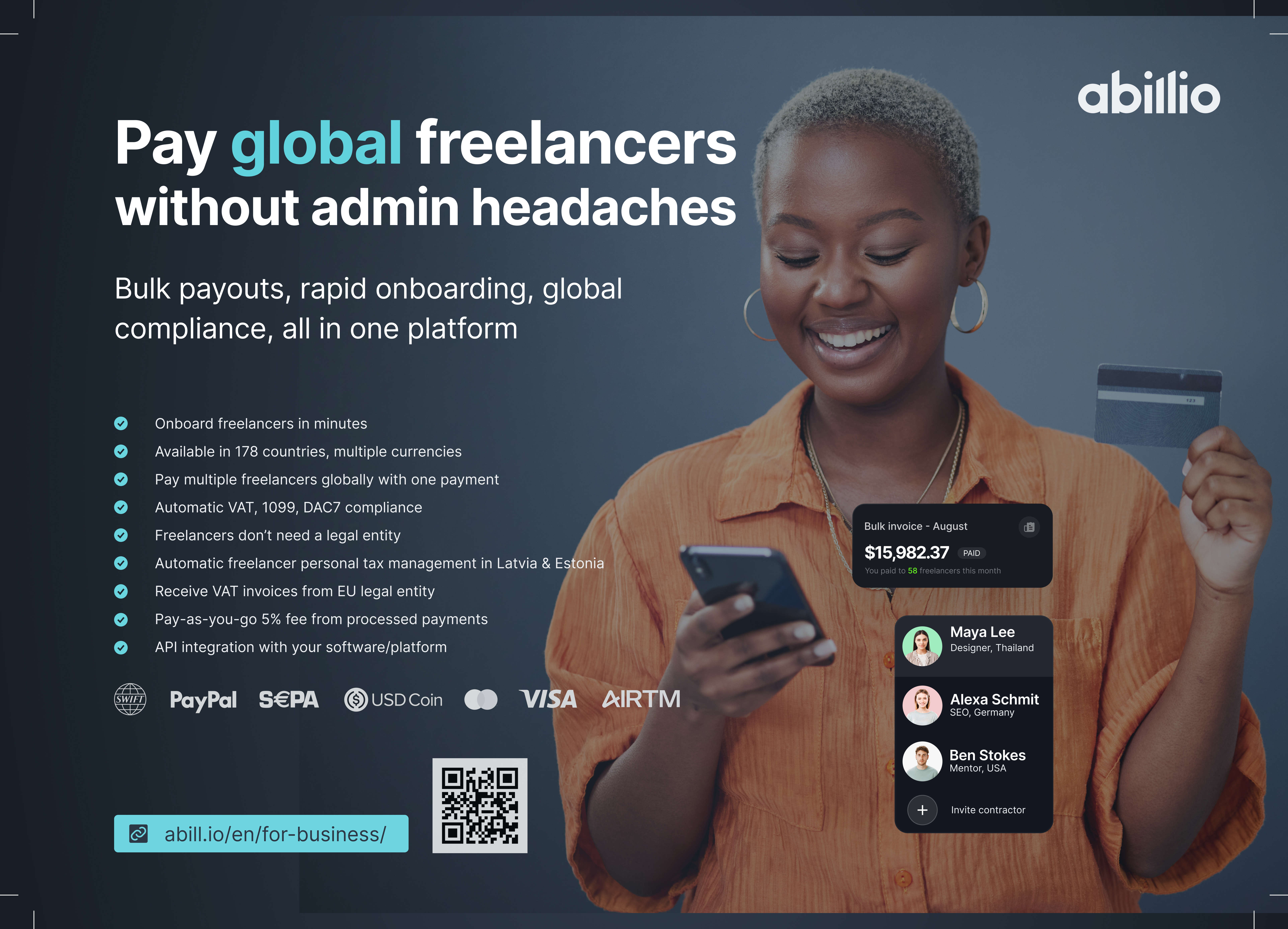
Independent female creative director checking a completed payment on her phone; warm orange overshirt; deep navy background; subject right, copy space left.

Freelancer campaign
Freelancer campaign

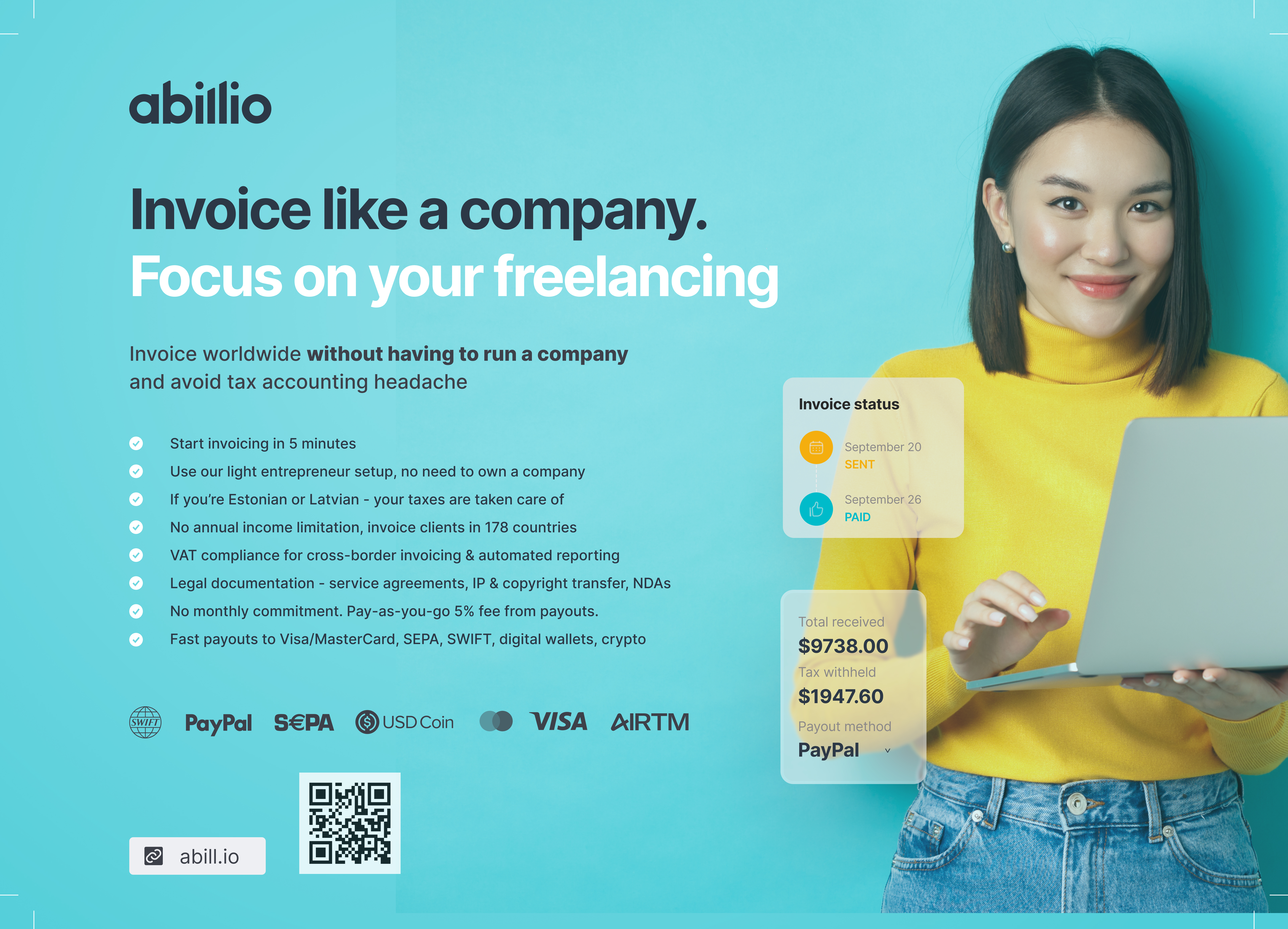
Young freelancer calmly finishing a client task; yellow knitwear; clean cyan studio; subject right, copy space left.

Lifestyle onboarding

Remote photographer stretching beside a blush-pink laptop in a soft home studio; pale gray, cream, and muted pink environment; subject right.

B2B campaign
B2B campaign

Confident operations manager reviewing contractor payouts on a laptop in a clean, bright office; subtle electric-blue objects; subject left, UI-overlay space right.

Global-team asset
Global-team asset

Three independent professionals from different regions collaborating naturally around one laptop; contemporary relaxed clothing; bright neutral setting.

09b · 3D explainer visuals

The API adapter

A 3D social explainer connecting your platform to invoicing, compliance and payouts. Requests go out; results come back. Adapt the photography palette and soft studio lighting to tactile materials, without changing the logo or product icon system.
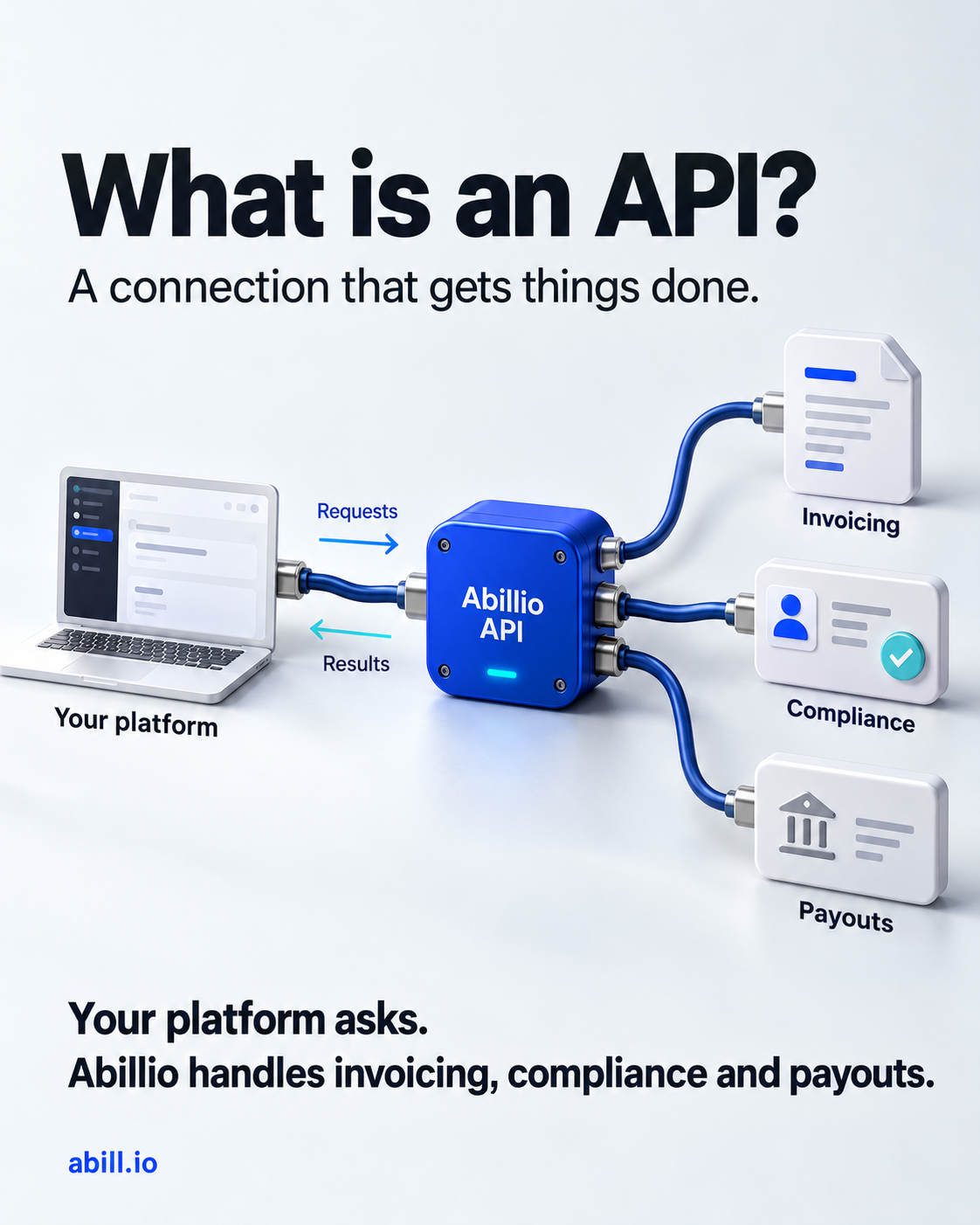
3D blue Abillio API adapter connecting a platform with invoicing, compliance and payouts, with requests and results flowing in opposite directions.
Generated with OpenAI built-in image generation · 5 October 2026 · Portrait social visual
Download image (PNG)Download prompt (TXT)
03OpenAI · 3D explainer

Exact prompt used for this image. Keep the request/result directions clear and service claims accurate. This is a campaign illustration, not a replacement for the outlined UI icon system.

Use case: infographic-diagram. Create a finished premium 4:5 portrait social media explainer image for Abillio, in English. Original concept: a sculptural 3D API adapter, not a burger, food or exploded layers. Make it an exceptionally polished editorial fintech visual, with spacious layout, one strong hero object and legible typography.
Backdrop: seamless soft white / mist #EDEFF2 studio, broad diffused daylight, realistic soft shadows. Palette Brand Blue #2945FF, Deep Navy #171E26, white, brushed silver, small cyan #61D2DC accent only. Materials matte blue precision-machined housing, white ceramic service objects, subtle brushed-metal connectors; tactile photorealistic CGI, not flat icons or neon cyberpunk.
Layout: generous margins. Top headline in large bold Inter-style sans, left aligned, near black: "What is an API?" Second smaller line: "A connection that gets things done."
Middle hero: a compact premium electric-blue adapter hub clearly labelled "Abillio API" in clean white sans (ordinary lettering, do not invent a logo). At left a small white laptop / app window sculpture labelled "Your platform", joined by a beautifully curved navy cable to the hub. On right three separate neatly arranged white 3D service objects connect by blue cables to the same hub: a folded invoice document, a simple ID card with a checkmark, a bank payout card. Each has a clean label beside it, respectively "Invoicing", "Compliance", "Payouts". Ensure the objects and labels are large, not a tiny diagram. Use asymmetric composition with visual elegance and plenty of air. The adapter is the central hero, with the 3 services fanning out vertically on the right.
Above/below the platform-to-adapter connection, two distinct thin directional arrows: arrow toward adapter labelled "Requests", return arrow toward platform labelled "Results". This must clearly show two-way software communication, not electricity generation or money literally flowing through wires. No extra arrow labels.
Bottom separated from illustration with generous whitespace, exact copy in clear dark navy sans: "Your platform asks." then "Abillio handles invoicing, compliance and payouts." Footer in small but legible blue ordinary sans text "abill.io". No typeset imitation of the Abillio wordmark, no invented logos, no watermark. No claims about automatic universal compliance, no v2 future features. All exact text spelled correctly, avoid extra copy. Elegant sophisticated social explainer, not crowded corporate stock art.
10 · Social media & ads

Social media
& ads

Ad creatives and content cards follow the same brand system as everything else — Brand Blue, Inter, real photography. The brushstroke splash pattern is an approved secondary graphic device when used in brand-correct colors.

Format specifications

LinkedIn post
1200 × 627 px
1.91:1
Article card, thought leadership, stats
LinkedIn carousel
1080 × 1080 px
1:1
Multi-slide education series
Instagram / X square
1080 × 1080 px
1:1
Ad creative, product proof, campaign
Instagram story / Reel
1080 × 1920 px
9:16
Short-form, CTA overlay on bottom third
Twitter / X banner
1500 × 500 px
3:1
Brand Blue field or Near Black
Outdoor / OOH banner
1440 × 480 px equiv.
3:1+
Headline only — no body copy at distance

Existing creatives

The ad and content card designs below use an approved layout pattern — but need color and typography corrections before they meet brand standard.

Existing social ad creatives
Ad creatives (Instagram / X)
4 variants · copy-left / person-right / splash pattern
Existing LinkedIn content cards
LinkedIn content cards
6 panels · article carousel · education series
✓Keep — already on-brand
→Copy left · person right layout — approved composition
→Brand Blue full-bleed background (bottom-right ad variant)
→Figma Hand italic for the accented keyword — correct typeface
→abill.io domain as the CTA — correct and direct
→Paint splash / brushstroke as secondary graphic device
→White reversed text on Brand Blue — correct colorway
→LinkedIn card structure — headline, body, photo, footer
→Stat-first format (31%, 71%…) — strong brand voice
✗Fix — needs correction
Splash colors
Neon green, bright purple, olive, red → replace with Cyan #61D2DC, Mint #A0EDBF, or Brand Blue #2945FF
Body typeface
Custom bold weight → Inter 700 or 800 only
LinkedIn heading color
Bright yellow/green underlines → Cyan accent only
Stock photo cutouts
Pure white bg cutouts → prefer candid real-environment photos
URL styling
Underline on body URLs → remove underlines outside of interactive links

Hybrid template · corrected colorway

Same composition pattern, brand-correct colors. The splash shape stays — only the hue changes.

Invoice like a
company
with abill.io
Cyan splash
Invoice and
get paid for
freelancing
abill.io
Brand Blue bg
Goodbye
complicated
accounting.
abill.io
Deep Navy bg
abillio
abill.io

Freelancer stats
that matter

31%of EU freelancers spend 1h+ daily on admin tasks
71%are not satisfied with current framework rules
87%face payment issues — late, partial, or disputed
11 · Presentations & slides

Presentations
& slides

The Abillio PRO deck is already well-aligned with the brand. The system below documents what is working, what to standardise, and the five reusable slide templates extracted from the live deck.

✓Already on-brand
→Inter used throughout — typeface compliance is perfect
→Brand Blue #2945FF as the sole accent colour
→Wordmark top-right on content slides, bottom-left on cover
→White dominant background — clean and spacious
→Brand Blue clipped circle as the right-edge decorative motif
→Dashed circle as subtle background texture (approved pattern)
→One bold headline word accented in Brand Blue per slide
→Single solid Brand Blue CTA button on closing slide
→Split layout (photo left / text right) for empathy slides
→Dense material moved to labelled appendix slides
!Standardise going forward
Heading colour rule
Main H1/H2 → Near Black (#000). Brand Blue only for the ONE accented word.
ALL-CAPS headings
Use sentence or title case instead. ALL-CAPS is not a brand pattern.
Photography environment
Warm pink interior is off-palette. Prefer cool neutrals or cyan-tinted environments.
Slide density
Some content slides are 10+ bullets. Max 5 bullets per slide.
Icon colour
Flow-diagram pictograms use unregistered dark teal. Switch to Deep Navy or Brand Blue.

Five slide templates

01 — Cover
Contractor infrastructure platform
Pay global freelancers
without admin headaches
Bulk payouts, rapid onboarding, global compliance
https://pro.abill.io
White bg · Huge black headline · One blue accent word · Blue circle right · URL bottom-right
02 — Section divider
Appendix 1
Global freelancers &
unsupported countries
Near-white bg · Small label above · Inter Black headline bottom-left · No body copy
03 — Blue panel left
Why
Abillio?
•Global freelancer coverage in 170 countries
•Legal entity provided — freelancer needs none
•SEPA/SWIFT + Visa/MC card rails
•Multi-currency EUR/USD/GBP/CAD/AUD
•Real human support
Brand Blue left 42% · White H2 inside · Right panel: max 5 bullet points · no body copy
04 — Photo left, content right
Why this matters?
•Speed is the real currency
•Payout delays frustrate freelancers
•Legal complexity blocks growth
•Admin pain slows delivery
Full-bleed photo left 44% · Brand-palette environment · Right: H2 black + max 4 bullets
05 — Stats / social proof
Trusted Payments Platform
Invoicing and payments, company-as-a-service & contractor-of-record platform in 170 countries since 2021.
16K
freelancers
100+
business clients
40K
processed invoices
25M
distributed in payouts
White bg · Label + body left 30% · Large Brand Blue numerics right in 2×2 grid · Dashed ring as texture

Presentation type scale

Display / Cover headline72–96 pt800 (Black)Cover and section divider H1 only
Slide H144–56 pt700–800One per slide. Near Black. One word in Brand Blue.
Slide H2 / subhead28–36 pt700Blue panel label, feature headings
Body / bullets18–22 pt400–500Max 5 bullets. Never smaller than 18 pt.
Caption / label13–16 pt500–600Appendix labels, metadata, URL line
12 · Partner Messaging

Partner Messaging

Official messaging for partners describing Abillio and Abillio PRO in written communication.

Name usageUse Abillio in all written communication. Use abill.io only when referring to the website address.

Abillio

FREELANCERS
What is it?

Abillio is an invoicing and payments platform that enables freelancers to invoice clients and receive payouts without establishing their own company.

Who is it for?

Freelancers, solopreneurs, and independent contractors working with local or international clients.

How is it different?

Unlike conventional invoicing software, Abillio provides the legal business structure behind the invoice. Freelancers can invoice clients professionally without managing their own company, business bank account, VAT registration, or accounting system.

How does it work?
  1. The freelancer registers and verifies their identity.
  2. They create and send an invoice through Abillio.
  3. The client pays the invoice to Abillio.
  4. Abillio processes the payment and the freelancer receives their payout.
  5. Tax treatment and payout options depend on the freelancer's country of residence.
Partner-ready description

Abillio helps freelancers invoice clients globally and receive payouts without setting up their own company. It brings invoicing, payment collection, supporting documents, and payouts into one straightforward platform. Since 2021, more than 17,000 freelancers have used Abillio to send 38,876 invoices and receive over €22 million in payments across 170 countries.

Taglines
→Invoice like a business. Focus on your work.
→Freelance globally. Leave the admin behind.
→Your work. Your clients. Less administration.
→From completed work to paid invoice.
→Global freelancing, made workable.

Abillio PRO

BUSINESSES
What is it?

Abillio PRO is a freelancer-management, self-billing, compliance, and global-payments solution for businesses working with independent contractors.

Who is it for?

Companies, agencies, platforms, and distributed teams that regularly onboard and pay freelancers or other independent service providers.

How is it different?

Abillio PRO combines contractor onboarding, verification, invoicing, documentation, reporting support, and payouts in one workflow. Contractors do not need to operate their own companies, while businesses receive a structured process and consolidated payment documentation.

How does it work?
  1. The business invites its contractors to Abillio.
  2. Abillio collects required identity, tax, and payout information.
  3. The business sets compensation and generates invoices through self-billing.
  4. The business makes one consolidated payment.
  5. Abillio distributes individual contractor payouts and provides their statuses.
Partner-ready description

Abillio PRO helps businesses onboard, manage, and pay independent contractors globally. It replaces fragmented invoicing and payment processes with structured onboarding, self-billing, consolidated payments, global payouts, and reporting support.

Taglines
→Pay global contractors without admin headaches.
→One contractor workflow. From onboarding to payout.
→One payment in. Multiple payouts out.
→Global contractor payments, made manageable.
→Spend less time managing invoices. More time growing your business.

Messaging Guardrails

Partners should not describe Abillio as:

✕A bank
✕An employer or traditional employer-of-record service
✕A way to avoid taxes
✕A guarantee of universal or automatic tax compliance
✕Ordinary invoice-generation software
Always clarify

Always describe tax, compliance, currency, and payout availability as dependent on the relevant country and circumstances.

13 · Downloads

Downloads

Fonts, logos, print assets, and presentations — everything partners need in one place.

Fonts

Aa
Inter (Variable)
Primary brand typeface — all weights
Aa
Inter on Google Fonts
Embed via Google Fonts CDN

Logo files

Print assets

A5 Flyer
A5 Flyer Side A
A5 Flyer — Side AOpen PDF
A5 Flyer Side B
A5 Flyer — Side BOpen PDF
Roll-up banner
Print-ready artwork · hello.abill.io/view/rollup
Open PDF

Presentations

PROAbillio PRO — Product presentation
Open
DECKPitch deck
Open
SLIDESEstonia · Latitude '59 screen slides
Open
abillio · app design systemIN PROGRESS

V2 App Design

Guidelines

Design language for the Abillio customer onboarding and dashboard experience. Outfit for clarity, Caveat for personality.

OutfitCaveatDark sidebarPill navHighlight accentsHand-drawn marks
01 · Typography
Primary — Outfit
Invoice
Dashboard
Get paid globally
Track payouts & clients
Reminding your clients automatically.
All transactions are encrypted and compliant.
Outfit 300–900 · All UI copy, headings, numbers, labels
Accent — Caveat
freelancer
business
“Almost before we knew it, we had left the ground.”
— Founder annotation only
Caveat 400–700 · Highlighted keywords, pull quotes, empty states. Max 1 instance per screen.
Highlight text treatment
I'm a freelancer
I'm a business
Outfit 900 stem + Caveat 700 inside a colored pill. Cyan for freelancer context, yellow for business. One highlight per sentence max.
02 · Color system
Brand Blue
#2945FF
Primary CTA, active nav, links
App Dark
#0D0F14
Sidebar, dark surfaces, overlays
Page Gray
#EBEBEB
Main content background
Card White
#FFFFFF
Card surfaces, modals, inputs
Highlight Yellow
#FFD43B
Business / attention accent
Highlight Cyan
#61D2DC
Freelancer / positive accent
Accent Purple
#6B3FE4
Decorative blobs, secondary moments
Accent Red
#E84141
Scribble marks, error states
Warning Orange
#F97316
Overdue, warnings, badges
Cool Gray
#667799
Secondary text, metadata, labels
03 · Core components
Sidebar navigation
abillio
⊡Overview
☰Invoices
◎Clients
⟳Payouts
⚙Settings
Dark #0D0F14 · Brand Blue pill active · 600 active, 400 rest
Dashboard cards
Available for payout
€42,069.08
€94.94 · Being paid out
Track payoutsRequest payout
Overdue
21
Review overdue
White card · 16px radius · 800 metrics · Orange warning · Blue CTA
Buttons
EURGBPUSD
Pill buttons (radius 100) · Filled Blue, Filled Dark, Outlined · Currency chips
Decorative language
Scribble · Red
Blob · Purple
Wavy underline
Hand-drawn icon
Max 2 marks per screen · Keep to card edges or hero areas
04 · Where this style goes

Two directions approved, four to explore.

Approved

Onboarding flows

Multi-step setup wizards with large Outfit display questions, Caveat-accented choice cards, and hand-drawn marks.

Outfit 900 displayCaveat keywordsIllustrated iconsPill CTAsHighlight cards
Approved

Product dashboard

Dark sidebar with Brand Blue active pill, white data cards on light gray canvas. Dense but breathable.

Dark nav sidebarWhite on #EBEBEBOutfit 700 metricsBlue pill activeThin icon set
Explore

Marketing landing

Light gray canvas, Outfit Black hero type, Caveat pull quotes, Blue CTAs. Purple and yellow blobs as texture.

Outfit 900 heroCaveat pull quotesBlob decorationsWavy underlinesYellow + cyan
Explore

Email campaigns

White body, Outfit 700 subject headlines, Caveat for one keyword. Brand Blue CTA. Max one scribble.

Single Caveat wordOutfit 700 headlineOne Blue CTAMax one scribbleFlat icons
Explore

Mobile app

Dark nav adapted to bottom tab bar. Outfit 600 labels. White cards 16px+ radius. Caveat for empty states only.

Bottom tab nav16px+ radiusOutfit 600Caveat empty statesBlue + white
Explore

Empty states & celebrations

Purple field. Caveat for main message. Outfit 500 supporting copy. Hand-drawn icons for payment confirmations.

Caveat displayHand-drawn illus.Purple fieldConfetti/scribbleOutfit 500
05 · Non-negotiables
✓ Use Outfit for all UI copy
Never substitute Inter or another sans in the app UI. Outfit is the V2 system font — even for tooltips, error messages, and footnotes.
✓ One Caveat instance per screen
Caveat has maximum impact when used once. One highlighted keyword or one pull quote per screen.
✓ Pill buttons, always
All CTAs use border-radius: 9999px (full pill). Never use square or slightly-rounded buttons in the V2 app UI.
✓ Dark sidebar only in Dark Navy
The sidebar background is always #0D0F14. Never use Brand Blue, slate, or gray — those conflict with the active pill state.
✗ No gradients
The V2 palette is flat. No linear-gradient or radial-gradient on backgrounds, buttons, or text. Solid colors only.
✗ Max 2 accent colors per screen
Each screen picks from Yellow, Cyan, Purple, Red. Never use all four simultaneously — pick 1–2 that match the context.